The Unorthodox Engineers
|
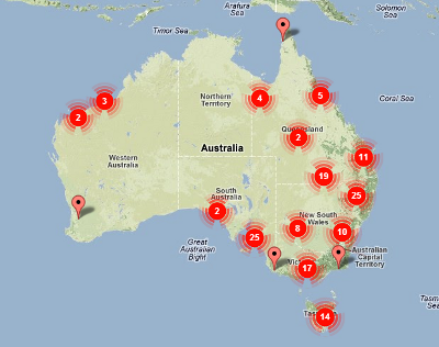
(screenshot. click to view live map)
|
This map combines near real-time information (hourly to daily updates) from multiple public agencies to give a composite view of fire incidents affecting Australia. It includes data feeds from:
The app is based on Google maps and is compatible with desktop and mobile browsers. Sentinel 'Heatmaps' are computed client-side (by your browser) and therefore run as fast as your computer will allow. Reduce the number of hotspot layers if the map is slow. (especially on mobiles) |
Map UpdatesThe map will not change after load. Refreshing the map page requests data from each agency feed immediately, so the update frequency depends on their systems. If you need more immediate alerts you should subscribe to your local fire authority's RSS feed. |
|
Sentinel 1.4 data service. Late in 2014, Geoscience Australia upgraded the sentinel service API to 1.4, so hotspots take slightly longer to load now, and might not be stable. Sentinel HotpotsThe MODIS (Moderate Resolution Imaging Spectroradiometer) package of sensors is attached to two NASA satellites; 'Aqua' and 'Terra' which do enough rapid polar orbits to scan most of the world twice a day each. A new satellite 'VIIRS' was recently launched, and is slowly being added to the mix. These satellites see into the near-infrared, and can therefore guess local temperatures with some accuracy. They are also quite sensitive to the presence of high-temperature spot sources. That means fires; either bushfires or open industrial furnances. The data is typically received by NASA a few hours after flyover, and then distributed perhaps an hour after that. The data we use is processed by Sentinel, part of Geoscience Australia, and they apply some aggregation and local corrections to produce datasets which represent detections across Australia within the last three days at intervals of 12, 24, 48 and 72 hours. Each hotspot detection is actually quite unreliable. At best the accuracy is 1.5km and there will be false positives from typical human activity as well as failed detections due to cloud and tree cover, or just bad timing. However when you see a 10x10km grid entirely filled with hotspots and growing with each daily pass, you can be pretty sure there is a large bushfire present. On the map, Hotspots are represented as a 'heatmap' layer which is scaled so that each detection leaves a 1/4 opacity 'smudge'. Four detections within a 5km area will produce a dark red spot in that location. More detections will just expand the size of the spot. These options are chosen to best represent the fuzzy nature of the data. Options exist to display less than all the available data, but only because the rendering speed of four heatmap layers is quite bad on mobile devices. I would have preferred to have a single consistent display with all four historical layers, but this pushes the limits. In most cases, major hotspot events will be accompanied by a nearby alert from the regional fire authority. |
Rural Fire ServicesEach of the rural fire services (except the NT) run real-time data feeds, in a bewildering variety of formats. These feeds tend to be updated most often during normal business hours, but high-priority incidents will be updated regularly even at night and on weekends. The alerts shown on the map will therefore tend to be a relatively good overview of all 'current incidents' that the regional firefighters are attending. Almost no filtering of these feeds is done beyond a basic attempt to focus on bushfire-related events. This decision has several reasons behind it:
Note that in many states (especially QLD and NSW) the various Park and Forestry authorities maintain their own fire services and a surprising number of 'large bushfires' are controlled burns for silviculture or fire management plans; which require that 5% of the state be burned each year to reduce fuel loads. |
